TLDR
- White vinyl is the safest material when accurate, bright color matters.
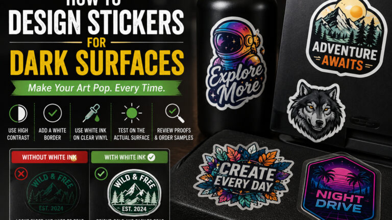
- Clear stickers usually need white ink behind important artwork when applied to black, navy, tinted, or dark-colored surfaces.
- Use light colors, bold shapes, and clear contrast instead of relying on subtle shadows or dark outlines.
- Add a white or light border when the edge of the design may disappear.
- Avoid small black text, dark gradients, and transparent color effects unless you have tested them on the final surface.
- Review the proof against a dark background and order a sample for large or color-sensitive projects.
A sticker can look bright and perfectly readable on a white artboard, then nearly disappear when it is placed on a black water bottle.
Nothing went wrong with the artwork. The surface changed the design.
Learning how to design stickers for dark surfaces means accounting for contrast, ink opacity, sticker material, lighting, and the color of the object underneath. These choices matter most with clear and specialty stickers, but even standard white-vinyl stickers can lose definition when their edges or darkest details blend into the surface.
The safest approach is simple: decide where the sticker will be used before finalizing the artwork. A design intended for white packaging should not automatically be sent to print for dark laptops, tinted windows, black equipment cases, or navy tumblers.
Why Dark Surfaces Change How Stickers Look
A dark surface affects both the outside edge of the sticker and the colors printed within it.
Black, charcoal, navy, dark green, and deep red can absorb visual contrast. Fine black lines may disappear. Dark shadows can merge into the background. Transparent ink may allow the surface color to show through and change the artwork.
This is especially important with clear vinyl.
Most printed color inks are not completely opaque. When color is printed on clear material without a white layer underneath, some of the surface remains visible through the ink. On a light surface, that may create a clean translucent effect. On a dark surface, pale colors can become dull, muddy, or hard to see.
CustomStickers.com notes that white ink helps logos, text, and colors stay visible on clear, dark, transparent, and reflective surfaces. Without the white layer, parts of the artwork can appear faded or lose readability.
The application surface is therefore part of the design. Treat it like another background layer.
Choose the Right Sticker Material First
The easiest way to design for dark surfaces is to begin with the right material.
| Sticker Material | Best Use on Dark Surfaces | Main Consideration |
|---|---|---|
| White vinyl | Full-color artwork, photos, logos, packaging | White base keeps colors solid |
| Clear vinyl with white ink | Clean, borderless look on dark objects or glass | White areas must be planned |
| Clear vinyl without white ink | Intentional translucent or stained-glass effect | Colors may become dark or muted |
| Holographic vinyl | Bold art with planned reflective areas | Material can alter color appearance |
| Glitter vinyl | Decorative designs with open sparkle areas | Heavy dark ink can hide the glitter |
| Matte vinyl | Subtle, low-glare branding | May look softer under dim light |
| Gloss vinyl | Bright colors and stronger visual contrast | Reflections can affect readability |
White Vinyl Is the Safest Option
Standard white vinyl provides an opaque base behind the entire design.
This keeps printed colors from mixing visually with the surface underneath. Yellow remains yellow. Pale blue stays visible. White text is created by the white vinyl itself rather than depending on the color of the object.
White vinyl is usually the best choice for:
- Detailed illustrations
- Photographs
- Exact brand colors
- Small text
- Pastel artwork
- Designs with subtle gradients
- Stickers used across many unknown surfaces
It also creates a dependable separation between the art and the object. If you do not know where customers will place the sticker, white vinyl creates fewer surprises.
Clear Vinyl Needs More Planning
Clear stickers work well when you want the object to show through the empty parts of the design. This can create a clean look on glass, black packaging, bottles, laptops, and product containers.
But clear material does not provide the same bright base as white vinyl.
CustomStickers.com prints clear stickers with white ink to help the printed areas remain visible, including on darker surfaces. The unprinted parts remain transparent, allowing the application surface to show through.
Use clear vinyl when:
- You want the design to appear directly printed on the object
- The surface color is meant to become part of the artwork
- You want transparent spaces between letters or design elements
- A white outside border would look too heavy
- The sticker will be applied to glass or smooth packaging
Do not choose clear vinyl simply because it sounds more polished. A white sticker with a clean die-cut shape may produce a better result when color accuracy and readability matter most.
Understand What White Ink Does
White ink can serve two different purposes.
First, it can appear as a visible color. This is how you create white lettering, linework, or design elements on clear material.
Second, it can be printed underneath colored artwork as an underbase. The white underbase blocks some of the dark surface from showing through the printed colors.
Think of it as priming a dark wall before painting it a light color. Without the primer, the original color affects the new coat.
Use white ink behind:
- Logos that need accurate color
- Light-colored illustrations
- Skin tones
- Yellow, orange, and pastel artwork
- Small text
- QR codes
- Product information
- Any detail that must remain opaque
You can also use white ink selectively.
For example, a clear sticker may contain a solid white logo while leaving decorative rays transparent. A holographic sticker may use white underneath a character’s face but leave the background open so the reflective material shows through.
CustomStickers.com recommends using white ink when the design requires solid color, contrast, or readability, while reducing or skipping it when the goal is to reveal the clear or specialty material.
That selective approach usually looks more intentional than placing white behind every part of a specialty sticker.
Use Strong Light-to-Dark Contrast
The most reliable colors for dark surfaces are colors that are clearly lighter than the background.
Useful choices include:
- White
- Cream
- Pale yellow
- Light blue
- Mint
- Bright orange
- Light pink
- Silver or reflective material
- Highly saturated accent colors
But brightness alone is not enough. Two colors can both be vivid and still have similar visual weight.
For example, deep red lettering on a black bottle may look bold on screen but become difficult to read in dim lighting. A white outline, cream fill, or lighter red can solve the problem.
Adobe’s general color guidance recommends prioritizing contrast and readability rather than using too many similar colors. It also suggests limiting the palette so each color has a clear role.
A practical sticker palette might use:
- One light main color
- One dark detail color
- One bright accent
- White for separation
That is usually enough.
Do Not Depend on Black Outlines
Black outlines are a common way to define sticker art. They work well on white backing paper and light-colored objects.
But on a black or charcoal surface, the outside line may vanish.
This can make the sticker shape look uneven or cause arms, hair, lettering, tires, shadows, and other dark elements to blend into the object.
There are several ways to fix this:
- Change the outer outline to white or cream
- Place a second light outline outside the black line
- Add a solid white sticker border
- Use a light-colored drop shadow
- Put the entire design on a simple light shape
- Increase the brightness of edge details
You do not necessarily need to remove every black line. Interior outlines can still provide useful structure. Focus on the outer silhouette and any important details near the edge.
Add a White Border When the Shape Needs Separation
A white border is one of the most dependable tools for stickers used on dark surfaces.
It creates a visual frame around the artwork and prevents dark edge colors from disappearing. It can also make irregular die-cut shapes feel cleaner.
White borders work especially well for:
- Character stickers
- Pet photos
- Dark logos
- Detailed illustrations
- Automotive artwork
- Gaming stickers
- Sports designs
- Artwork sold as general-purpose merchandise
CustomStickers.com generally uses a border around 0.08 inches, although the amount can vary based on the artwork and requested look. Its design guidance also notes that white borders can help separate artwork from laptops, bottles, boxes, and other dark surfaces.
A border does not always need to be white. Cream, pale blue, light gray, or a bright brand color can work.
The important part is separation.
Avoid a border color that is only slightly lighter than the surface. A charcoal border on a black laptop still has the same basic problem.
Design Clear Stickers Against the Actual Surface Color
Do not design a clear sticker on a white digital canvas and assume it will look the same on a black object.
Create a mockup with the likely surface behind it.
In your design program:
- Add a black, navy, charcoal, or dark-colored background layer.
- Place the sticker artwork above it.
- Reduce the opacity of colors that will not receive white ink.
- Add a white underbase layer where opacity is required.
- Check the design at the final printed size.
Create several preview backgrounds when the sticker may be used on different objects.
A clear logo intended for both a black laptop and a transparent storefront window should be tested on:
- Solid black
- Dark blue
- Clear glass over a light interior
- Clear glass over a dark interior
- Tinted glass
A design that works in one setting may fail in another.
Tinted vehicle windows deserve extra attention. CustomStickers.com warns that printed ink on clear material may be difficult to see against dark tinted glass without a white background or white ink.
Make Text Larger and Heavier
Thin lettering is fragile in print.
On a dark surface, it has to compete with the background, reflections, texture, and viewing distance. Fine script fonts and delicate white lines may look elegant at 500 percent zoom but become faint on a two-inch sticker.
Use:
- Medium or bold font weights
- Open letter shapes
- Short wording
- Clear spacing
- Thick white strokes
- High-contrast text colors
- Simple typefaces for small information
Avoid:
- Hairline fonts
- Closely spaced script
- Long paragraphs
- Small dark text on transparent material
- Thin colored letters without an underbase
- Several outlines around the same word
Print the design at its actual size on ordinary paper. If you need to hold it near your face to read it, the type is too small or too thin.
Be Careful With Shadows, Gradients, and Transparency
Subtle effects are often the first details to disappear on dark surfaces.
A soft gray shadow may merge into black. A transparent yellow glow may turn greenish or brown depending on the object. A dark blue gradient can lose its lower half.
That does not mean gradients are off limits. They simply need stronger endpoints and enough opacity.
Before printing, check:
- Where the darkest gradient color meets the surface
- Whether the shadow adds definition or muddies the edge
- Whether semi-transparent colors need white ink
- Whether highlights remain visible
- Whether important features depend on subtle tonal differences
For a sticker that must work on many surfaces, flatter color and stronger shapes are usually safer.
Plan Specialty Materials Intentionally
Dark surfaces can make holographic, glitter, chrome, and other reflective stickers look especially dramatic. The contrast between the dark object and the reflective material can be strong.
But the material should remain visible.
Holographic stickers reflect changing rainbow colors as light moves across them. CustomStickers.com can also add white ink to holographic designs when certain areas need a more solid appearance.
For holographic or glitter designs:
- Leave selected areas unprinted to reveal the material
- Use white ink behind faces, text, and important colors
- Keep lettering bold
- Avoid placing small text over active reflective areas
- Do not cover the entire sticker with heavy dark ink
- Expect colors to look different than on white vinyl
CustomStickers.com notes that darker colors and heavy ink coverage can reduce the visible effect of glitter vinyl, while lighter or less heavily printed areas reveal more sparkle.
Specialty vinyl is part of the artwork, not just the paper it happens to be printed on.
Consider the Sticker Finish
Matte and gloss finishes can both work on dark surfaces.
Gloss laminate often makes colors appear bright and saturated. It can be a good fit for bold logos, illustrated stickers, bottles, and outdoor designs.
But gloss also reflects light. On a curved black bottle or glossy laptop, glare can temporarily hide small text.
Matte reduces glare and can feel more integrated with dark powder-coated surfaces, electronics, notebooks, and packaging. The tradeoff is that colors may look slightly softer.
Choose gloss when:
- Bright visual impact is the priority
- The artwork contains bold colors
- The sticker will be seen mostly straight on
- Reflections are not a problem
Choose matte when:
- The object already has a matte finish
- The design contains text
- The sticker will sit under overhead lighting
- You want a quieter, less reflective look
The finish will not repair poor contrast. It should support an already readable design.
Prepare the File for Printing
Dark-surface artwork should follow the same basic print-preparation rules as other sticker files, with extra care around borders and transparency.
Use a high-resolution raster image at the final size or submit vector artwork when possible.
Keep:
- Text inside the safe area
- Important details away from the cutline
- Transparent areas truly transparent
- White-ink instructions clearly labeled
- Background layers separate from the artwork
- The original layered file available for revisions
For bordered designs, CustomStickers.com recommends leaving at least 0.05 inch between the artwork and cutline. For full-bleed artwork, the cutline may be brought approximately 0.03 inch inside the art, so critical details should not sit at the edge.
When white ink placement matters, provide a note explaining the intended effect.
Examples:
- “Print white behind all colored artwork.”
- “Leave the stars transparent so the black bottle shows through.”
- “Print the logo in solid white ink.”
- “Leave the background open to reveal the holographic material.”
- “Use white behind the QR code and black squares.”
A printer should not have to guess which transparent areas are intentional.
Test the QR Code on the Dark Surface
QR codes need sharp contrast.
A transparent QR code placed directly over black, navy, or a patterned surface may not scan consistently. The camera needs to distinguish the code modules from the background.
Use a solid white or very light panel behind the entire code, including its surrounding quiet zone. Do not place the code over holographic material, glitter, a photograph, or transparent artwork.
Then test it:
- At the final printed size
- On the actual dark surface
- Under normal indoor lighting
- In brighter reflected light
- With more than one phone
- From the expected scanning distance
The scanner does not care that the design looked cleaner without the white box.
Review the Proof on a Dark Background
A standard proof may show the sticker on white.
That confirms the cutline and general layout, but it may not show how the design will behave on a dark object.
Place the proof image over a dark background before approving it. Check the edge, small text, shadows, transparent areas, and any color that is close to the application surface.
Pay particular attention to:
- Black artwork touching the cutline
- Dark hair or clothing
- Navy brand colors
- Pale transparent colors
- Fine white lettering
- Thin outlines
- White ink coverage
- QR codes
- The size of the outside border
For large orders, product packaging, or strict brand colors, order a small test before committing to the full quantity. Physical samples reveal how the material, ink, laminate, lighting, and surface color interact in a way a screen cannot fully predict.
Practical Design Examples
Black Water Bottle
Use white vinyl or clear vinyl with a white underbase. Choose a compact shape and avoid a wide design that wraps too far around the bottle. Light text and a white outside border will remain easier to see.
Dark Laptop
A light die-cut logo can work with or without a border. If the artwork has a black outline, add a second white outline so the silhouette remains clear.
Tinted Car Window
Use white ink behind the main design. Test the decal from outside the vehicle with the interior both bright and dark. Avoid transparent dark text.
Black Product Packaging
White vinyl provides the strongest color consistency. Clear vinyl can create a direct-print look, but use white under important colors and product information.
Navy Equipment Case
Use a pale border and thick lettering. Matte laminate may help reduce reflections under overhead lighting.
Dark Storefront Glass
Design for both daytime and nighttime viewing. A decal may have a bright interior behind it during the day and a dark interior after closing. White ink usually provides the most dependable result.
Common Mistakes to Avoid
The first mistake is approving artwork only on a white screen background. The customer will not apply the sticker to your artboard.
The second mistake is assuming clear means invisible. The material may blend into the object, but the printed colors still need enough opacity and contrast.
The third mistake is using black as the only outline color. It can disappear against the surface and weaken the sticker’s silhouette.
The fourth mistake is relying on small pastel details. Without a white underbase, they may become muted.
The fifth mistake is applying a full white layer to a holographic or glitter sticker when the goal was to show the specialty material. Decide where the effect should appear.
And the sixth mistake is skipping the physical test for a large order. Screens cannot accurately reproduce transparency, reflectivity, surface texture, and every lighting condition.
Design for the Object, Not the Empty Canvas
The best dark-surface stickers are planned for their surroundings.
Start by choosing the material. Use white vinyl when you need dependable color. Use clear vinyl when transparency improves the design, and plan white ink wherever readability matters. Strengthen the outer edge, simplify fine details, and test the artwork against the real surface color.
Then look at the sticker at its actual size.
If the text is clear, the silhouette holds together, and the important colors remain visible without perfect lighting, the design is ready for a proof.
A dark surface can make a sticker look especially sharp. It just should not be treated like a white background with the brightness turned down.